End of Financial Year Events North Sydney & Sydney Olympic Park. Find out more >
-
 0283762900
The RAFI Gallery: Artists In Residence
The RAFI Gallery: Local Artists In Residence
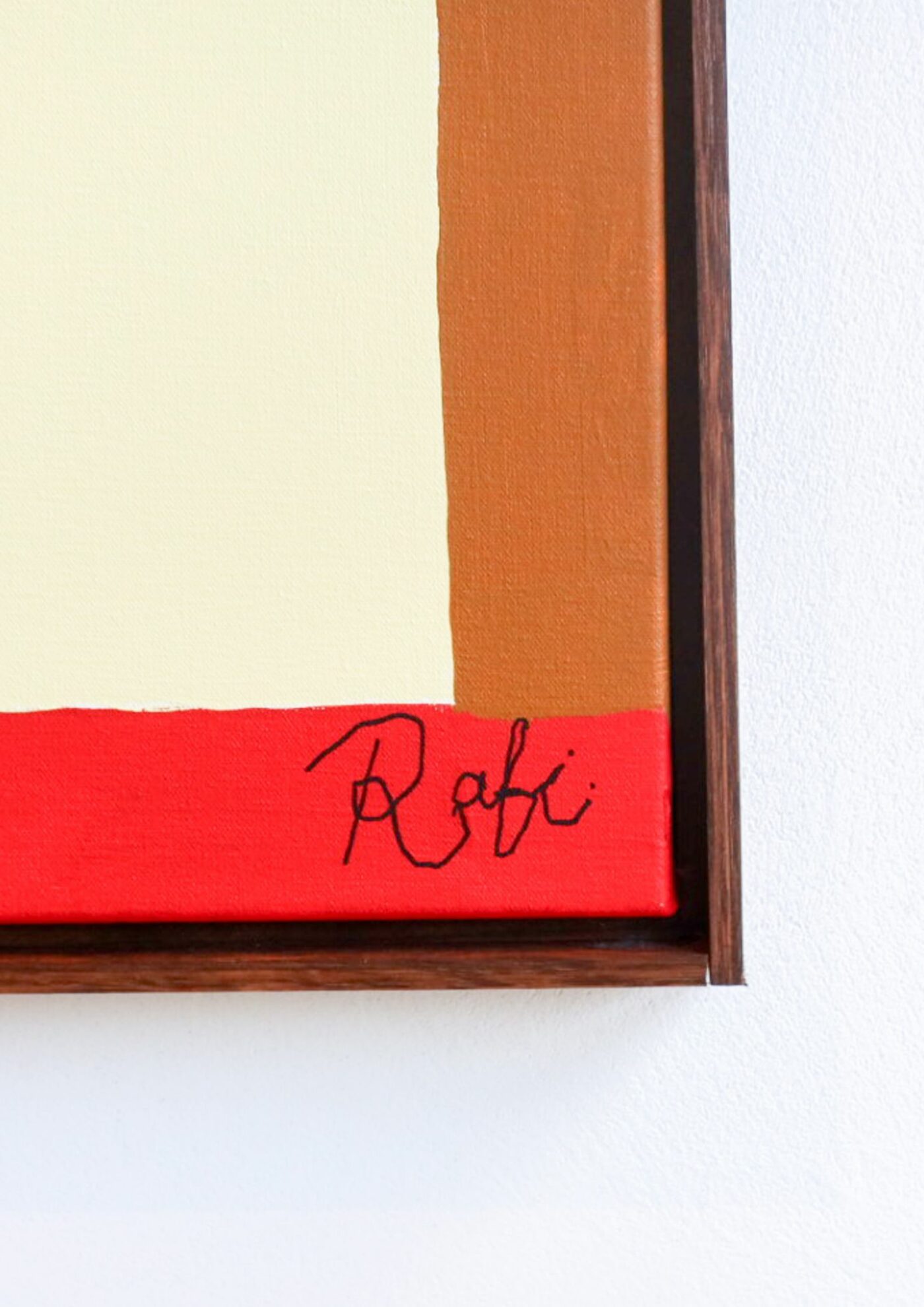
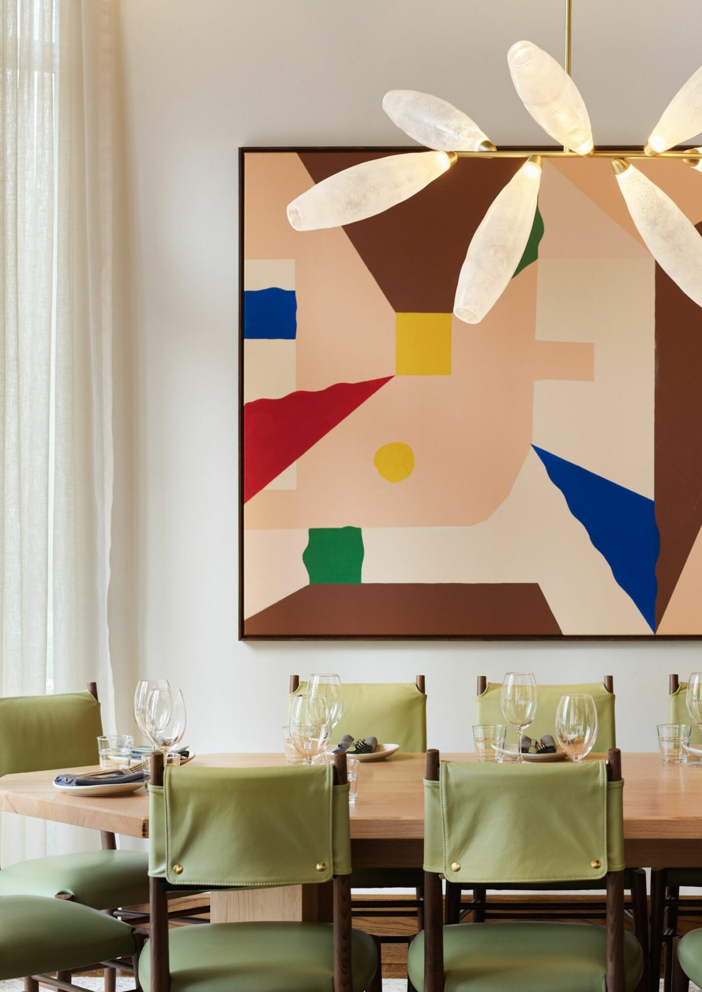
“We wanted something abstract, geometric and playful, to echo the fit-out and colours pulled from the palette” – Laura Arango Gil, Luchetti Krelle
Thoughtfully designed by Luchetti Krelle, RAFI is celebrated for its maximalist, youthful interiors and the fusion of creative concepts that may not align in theory. However, when these elements come together, they effortlessly form a cohesive whole.
“We wanted something abstract, geometric and playful, to echo the fit-out and colours pulled from the palette” says interior designer and stylist Laura Arango Gil from Luchetti Krelle. “At concept stage, the palettes did make Ben and Hamish a little nervous given punchy shades mingle with power pastels, but we designed breathing spaces amongst the creative zoning. If you look at the abstract canvases commissioned on behalf of RAFI by owner Hamish Watts’s friend (affectionately dubbed the Banksy of North Sydney), you’ll notice their colours convey the complimentary clashes of RAFI’S internal palette”.
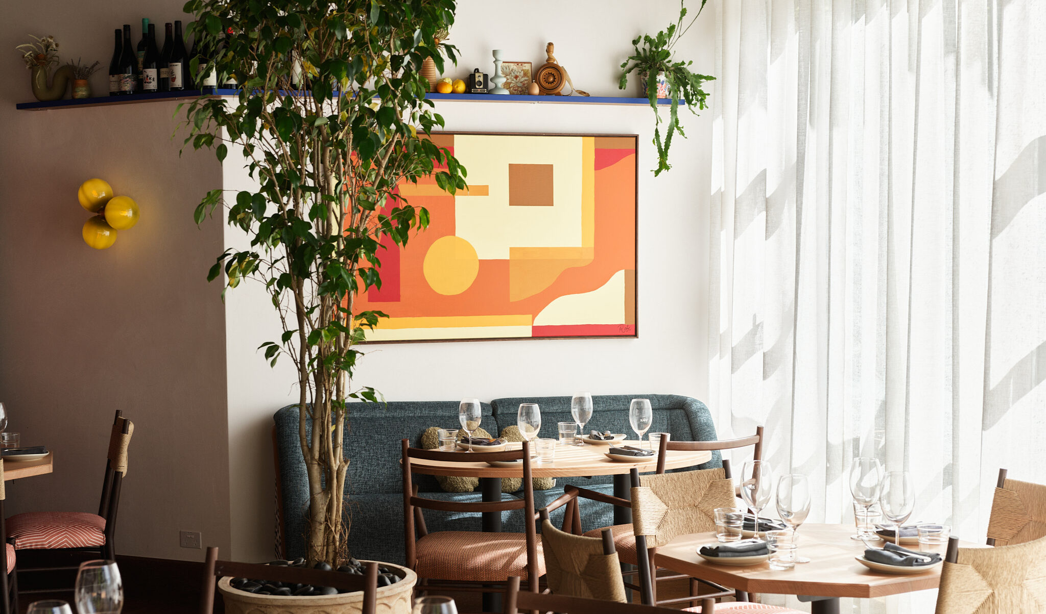
Read on to find out more about key pieces by celebrated local artists, highlighting RAFI’s goal as a restaurant for tomorrow that forges sustainability and connection.
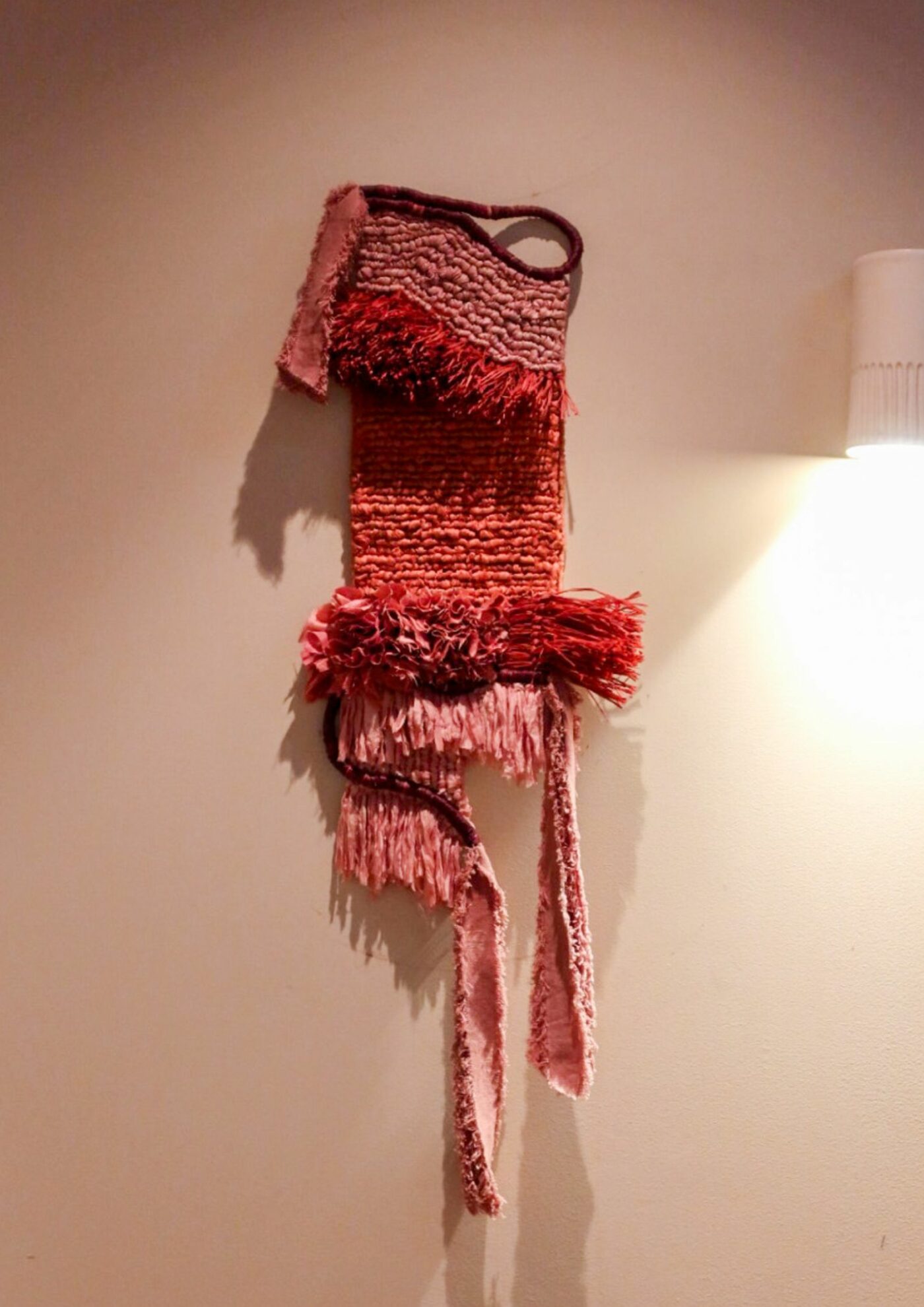
Hello Mantle by Zoe Jones
Sydney born artist Zoe Jones has always been drawn to art, and after years of dabbling in graphic design, illustration, animation and more, she settled on textiles as the medium for her art and storytelling.
The piece at RAFI titled ‘Hello Mantle’ uses a combination of locally sourced and hand-dyed; Malagasy raffia, recycled silks & cotton in earthy red ochre & pink clay tones, layered like the earth’s core.
“I think it ties in beautifully with the restaurant through its colour palette and composition, and seems to speak to Rafi’s aesthetics in interior design but also through the menu. The terracotta orange in the artwork tying in with the orange umbrellas and the blood orange mignonette; The burgundy raffia, tying into the wooden chairs but also the crispy eggplant. Compositionally it features a combination of straight and curved edges which Rafi does so beautifully throughout the restaurant! It’s also nice to know Rafi holds similar values to contributing to sustainability as I do when I make my art”.
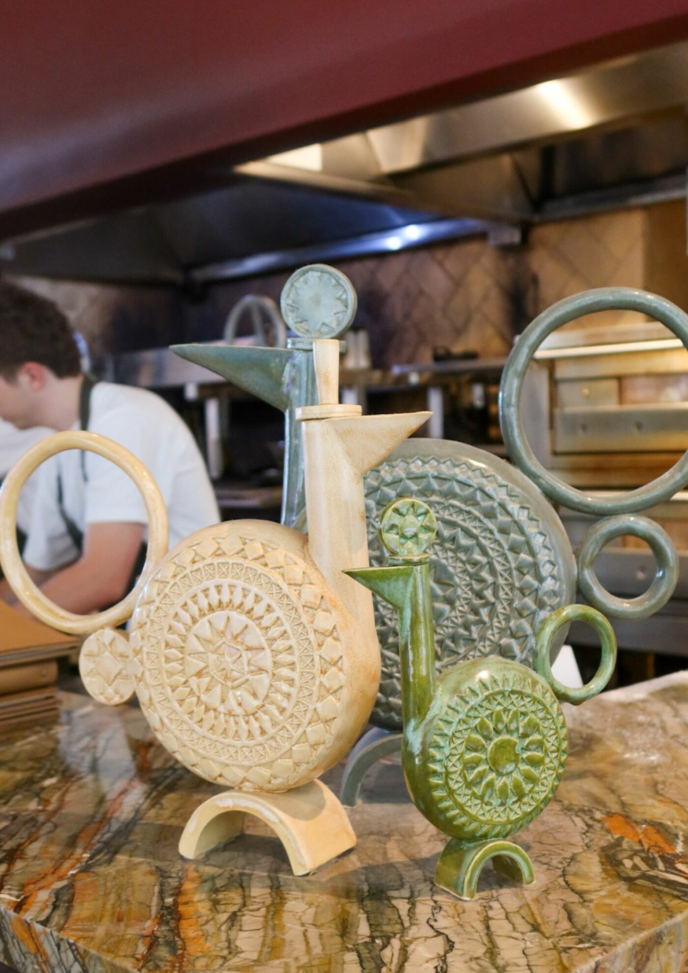
Spring Chicken by Scott Duncan
Artist Scott Duncan is a close friend of the Applejack Family, a former Chef and colleague who had a connection to the brand. His pieces are heavily influenced by mid-century production pottery with a unique twist. Scott starts with a familiar silhouette or form in mind, then it morphs into another form that evolves in the studio while he works.
Scott likes to use raku for his pieces but hand-makes his stamps and some tools which help with different effects and textural finishes. A combination of underglazes and glazes achieve a collage-like effect and define the contrast between matte and gloss.
“RAFI has a contemporary and vibrant interior with nods to mid-century and that is reflected in the aesthetics of my work. Chickens and game birds are quite a traditional motif or form – from ancient pouring vessels to kitsch salt and pepper shakers – and Spring chicken is subtly playful interpretation of that”.
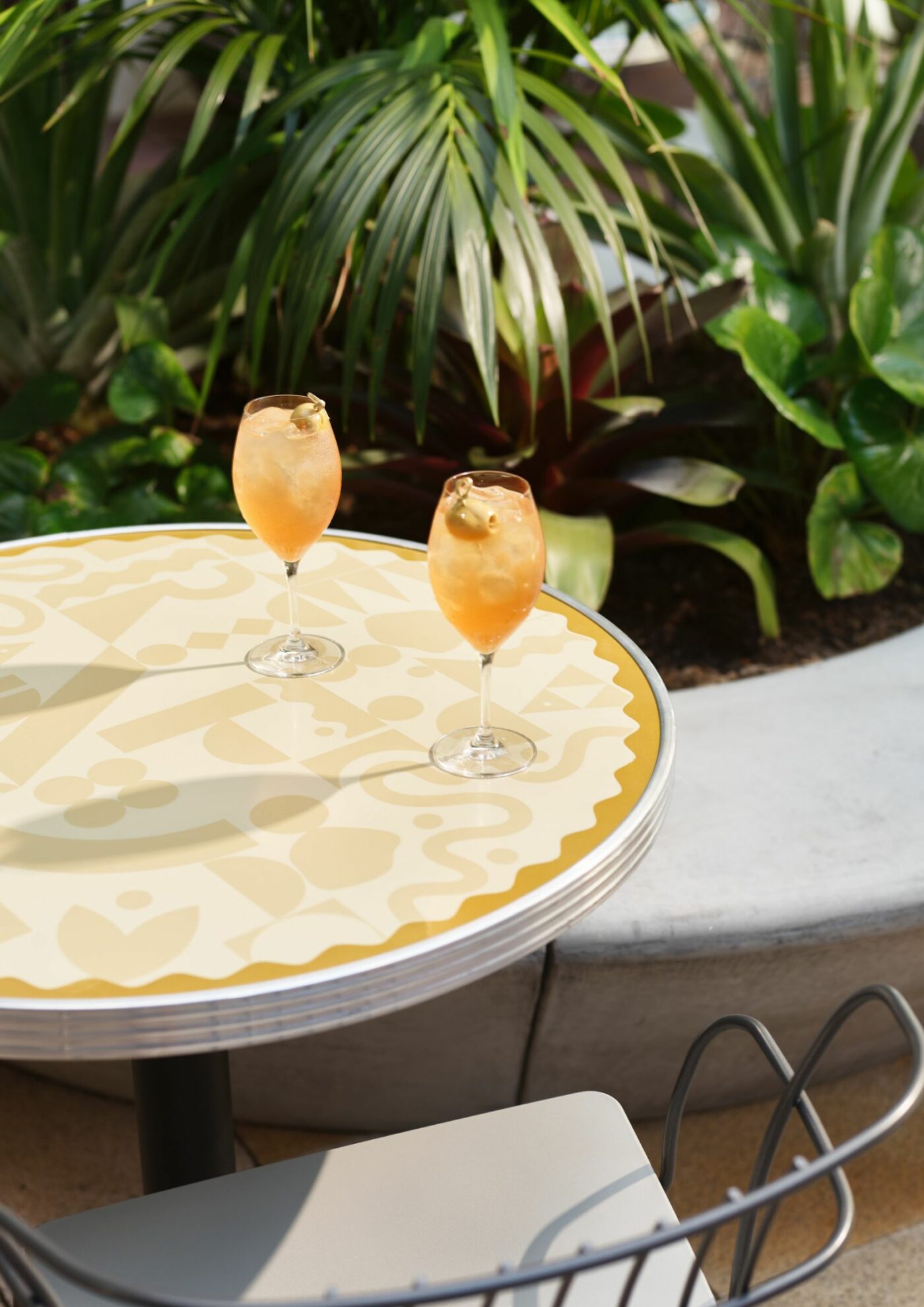
Graphics and visuals by Julia Jacque
Julia Jacque is a multidisciplinary designer working across a range of industries spanning across food, beverage & lifestyle brands. She finds herself approaching projects with a sense of curiosity and constant discovery until she unveils a unique approach to the brief.
“The outdoor tables were designed in less than 24 hours. Before the design of the branding had begun we were thrown in the deep end with this design task. The space Luchetti Krelle had already begun designing featured many geometric shapes throughout, but we wanted to push the design further by creating something completely unique to RAFI. We played with shapes, typography, symbols and tonal colour palettes. If you look carefully, you can see the restaurant name amongst the shapes. This print then became rolled out into the venue for items like grease proof paper”.